


The Kings Centre
33-35 Victoria Road
Burgess Hill
RH15 9LR
United Kingdom
Venue
Although the competition evening was cancelled because of the Covid 19 virus, the images have been judged and the results have been published by the host club Mid Sussex. Special thanks must go to Simon Baker and his team at Mid Sussex Camera Club for adapting to the current coronavirus crisis and arranging for the marking, adding comments, etc to be carried out by Marcus Scott-Taggart via the internet.
Marcus has made a huge extra contribution by commenting on all of the images that were submitted as pdi files by our member clubs. This means that the winning club, the best image and the full results, together with the comments and a selection of images will be available to download to share with our Regnum Group club members.
A marvellous achievement by all concerned and congratulations to the winners Chichester Camera Club, to Steve White of Henfield C.C. for the “Best Image" and to all Regnum Group members for their support.
Thank you Marcus and the Mid Sussex Camera Club team.
Best wishes to all and keep safe.
The Regnum Committee
All being well the next Regnum Competition will be for the Regnum Print Shield that will be hosted by Southwick Camera Club, on 19th November 2020 at The Barn Theatre, Southwick Community Association.
Results
| Club | Score | |
|---|---|---|
| 1 | Chichester | 145 |
| 2 | Henfield | 143 |
| 3 | Mid Sussex | 143 |
| 4 | Southwick | 132 |
| 5 | Littlehampton and District | 128 |
| 6 | Storrington | 127 |
| 7 | Steyning | 124 |
Judges Comments
| Club | Title | Author | Score | Comments |
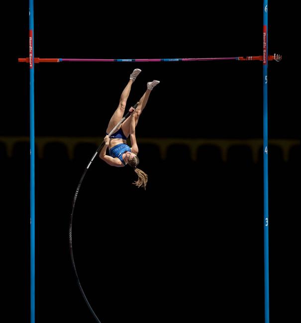
| Chichester | Alysha Newman | Andy Dulson | 20 | In the same way that the photograph of the eagle was taken from the perfect position so too is this photograph of the pole vault. The timing of this is perfect. Of course, I don't know if this was a photo session or a competitive event but for judging the photograph it shouldn't matter which it is. Only that one is under your control and the other not. Either way the lighting is perfect, the framing is perfect her position is perfect and where she is in relation to the cross bar is perfect because we are still left with the question did she or didn't she? |
| Chichester | Home from market | Sarah Nicloll | 17 | Travel shot with an impressive background behind the primary subjects. Good misty recession to the far mountain but still holding enough detail to see the terraced agriculture and the distant white building. The three ladies look only a little weary after what must be a mighty trek. The composition does give a hint of a meandering path through the scene which slowly draws the eye away from the ladies down to the corrugated roof of the house but because of their colourful costumes they remain the dominant feature and the eye quickly returns to them. |
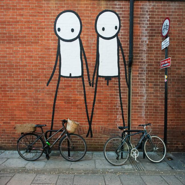
| Chichester | Don't get it caught in the chain George | John Howes | 17 | Street photography often needs no support from a title to convey its message. I must have looked at this on three separate occasions just taking it at face value. It was two characters & two bicycles. An example of what the street photographers call "borrowed art". Using art plus some mundane object to create a comment that needs both to come alive. It wasn't until I started to write this review that I came to understand fully what it was all about. Even then it was a fairly slow process. I started by realizing that one of the bikes was a girl's bike and the other, with a cross bar was a boy's. Only then did I notice the genitalia and finally the full impact of the photographer's humour fell into place. Sorry it took so long but i got there in the end. |
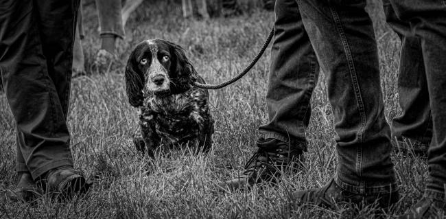
| Chichester | It's a dogs life | Lorna Brown | 20 | So much humour. It is impossible not to anthropomorphise the spaniel's facial expression with the eyes looking sadly up to the faces of the owners of all the legs. Is it boredom, is it being ignored, has it been chastised? Does it want to be a part of whatever is happening above - who knows. But what we can tell is that this is an excellent piece of observation beautifully composed to emphasis the clear message it presents. It wouldn't work as well as it does if it was in colour. The monochrome supports the mood and message. |
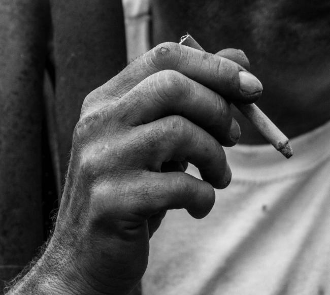
| Chichester | The workers hand | Michael Harris | 16 | Good gritty monochrome subject. Little things make it interesting. The broken skin on the knuckle and the broken fingernail. The damage to the thumb skin and the little tip of thumbnail just peeking out above the thumb. All these things support the title that it's a worker's hand in fact it's a well-worn, manual workers hand. There is something a little strange with the cigarette. The ash on the tip looks solid. The filter end does seem to have a cork tip so I'm happy to accept that it is a genuine cigarette but it does look a bit like a statue's cigarette. |
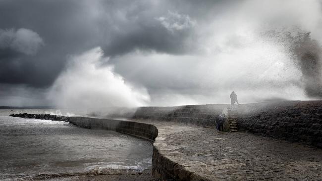
| Chichester | Port in a storm | Jim Munday | 20 | Timing, shutter speed, position of your viewpoint relative to the lighthouse, detail in the foam and spray, muddy colour of the churning sea and the explosive breaking wave diagonally balancing the right of the frame with the visual weight of the frozen detail in the left lower corner, I appreciate every element of this photograph. OK so it's been a popular subject over the last couple of years and we've had a few storms with which to practice but that should not be an excuse to undermine the joy of seeing it so well executed. |
| Chichester | Brave or Foolish | Jim Munday | 18 | Your title poses a question the answer to which, I suspect, will depend upon the age of the observer. It's a striking scene, full of activity both from nature and from the people. The two cowering by the steps seeming to have a better developed sense of self-preservation than the person climbing to the top of the sea wall. The scene dictates how much you need to include in the frame. The fact that we can see right to the end of the breakwater is important as is the less interesting but equally important stonework on the right of the frame. Without that we wouldn't see the complete spray of the breaking wave. Arguably if you had made the letterbox crop more severe by cutting off the base you would have increased the importance of the figures within the frame. However, the crop you have chosen does make the point of how insignificant the tiny people are in the face of the sea's power. |
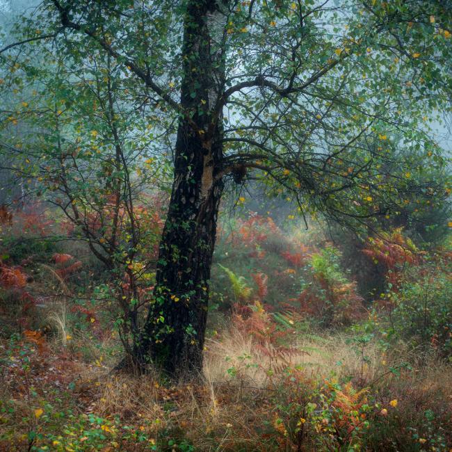
| Chichester | At Stedham | Richard Corkrey | 17 | Almost a fairyland scene. One expects to see Victorian fairies flitting from plant to plant. One of the things that emphasises this is the fact that I think the colours are slightly over saturated and in combination with the mist adding recession to the picture gives the whole thing an unreal quality to it. In this case it is not meant to be a criticism. I think the treatment, whether intentional or not, adds to the success of the photograph. Good composition with the placement of the tree with the arch on the right opening a way for us to venture further into the woodland even though the route on the left of the tree is blocked. |
| Henfield | Bluethroat | David Barrett | 18 | Alert bird caught in a classic pose that clearly shows its identity, it is scaled for us by the stalk perch and the diagonal across the well softened, unobtrusive yet interesting background is a bonus. At first you might think that this should have been in portrait format, but the landscape inclusion of the extra background works very well. I think the composition is a good choice with the visual weight being just offset a little to the left of centre of the frame with the head clearly outlined against the dappled background. |
| Henfield | Pitts Special | Richie Goodwin - | 18 | Good angle of the plane, beautifully sharp and detailed considering you have used a shutter speed long enough to blur the prop. You can almost identify the make of the pilot's headset. On it's own it is an excellent example of its genre. In this competition its score reflects its position in comparison with the others it is up against. |
| Henfield | Georgia | Sylvia White | 19 | Creative composition with her hard against the left of the frame. Just right for her jaunty head angle and inquisitive look. Very professional looking model - confident and relaxed. Lighting soft with soft shadows that complement her perfect skin (or careful retouching) Love the fine chain around her neck and the crop cut hair framing the very feminine face. It's humorous whilst remaining flattering and a perfect subject for the monochrome treatment. Solid black background can sometimes lead to a harsh lighting effect but her black top merges well into the background leaving us with no distractions to divert attention away from the face. |
| Henfield | The Fly | Peter Meares | 19 | Lovely macro of a fly. Beautifully evenly illuminated and shows the differential refraction of light coming from its body creating the rainbow-like iridescence. As one would expect there is a very narrow depth of field and because of that it doesn't appear to be stacked. Which in turn means that the plane of focus has been very carefully positioned to give us enough detail to appreciate the structures that are most important for us to see. The eye, the mouth parts, the leading edge of one wing and the hairy legs - excellent. |
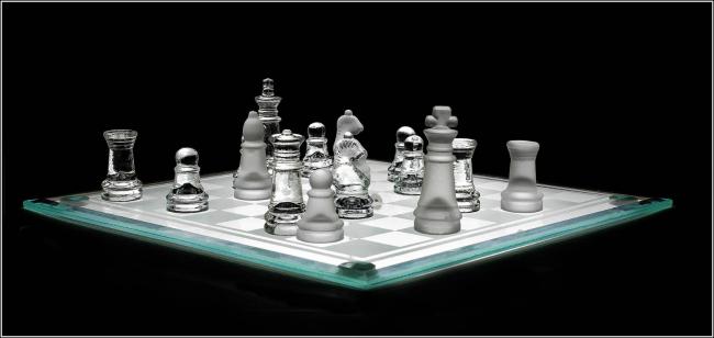
| Henfield | Check Matem - Best Image Crouch Shield 2020 | Steve White | 20 | If any photograph shows how wrong the faint-praise phrase "Only a record shot" is, this is it. It is completely successful at telling you everything there is to know about this chess set with an image that could win prizes at an art gallery. I would love to know how this was illuminated to get no shadows on the board, no harsh shadows anywhere and white reflections in the transparent glass pieces so their shapes are well defined against the black background. Perhaps a soft box over the top, shooting through a translucent tent - who knows. Is it stacked to get that degree of sharpness across the full depth of the board? Was it shot with a medium or large format camera, perhaps with panel movements to control the plane of focus - I just don't know. All I can say is that whatever technique was used it has resulted in a superb image. Congratulations. |
| Henfield | 9-9-9 | Cliff Carter | 16 | Good feeling of speed, clearly panning has taken place but you haven't quite panned at the perfect speed to get the motorcyclist as sharp as he/they could be. Lots of good points though. Front and sidecar wheels off the ground as they turn. Good movement on the front wheel tyre showing it's rotating and nice blurring of the spectators. It's not easy to get the panning speed just right to get the bike and the riders sharp but it is possible and for a competition photograph it is expected |
| Henfield | Sleepy Kitten | Paula Blake | 17 | Impossible to look away from those eyes. They grab your attention and hold it. The rest of the cat fades away into the background. Even the delightful ears play second fiddle to the eyes - which is just as it should be. One entirely subjective criticism, wholly personal but something that makes me a little uncomfortable with the final crop. The gap between the tail and the bottom of the frame is greater than the gap between the tip of the ear and the top of the frame. For me that makes the whole subject seem to be floating high in the frame. If there was some detail in the carpet foreground that was relevant, then so be it but the tail is really the base of the subject. I don't want it touching the frame but I do want it closer to the base. The gap between the ear and the top should be the larger gap of the two. |
| Henfield | On Golden Pond | Steve White | 16 | Classic scene of the ruined pier at Brighton. Nicely balanced composition with the posts and the derelict filling the frame and each quite different shape having rather attractive reflections below them. My initial reaction to the scene was that the golden colour was overdone - over saturated and not believable. However, the longer I look at it the more I think that was an over reaction on my part and although I am still convinced that it is over saturated, I am more ready to accept that I have seen sunsets with that level of colour. Admittedly not off the South Coast of England and never without the sun either being in the picture or clearly just below the horizon. But I have come to accept this interpretation. |
| Littlehampton and District | Mirror Vision | Michael Dove | 15 | It was a good idea and capturing the expressions of the four ladies trapped in the slices is clever observation. The men are relegated to fairly minor roles in the visual drama. However, because of the inclusion of the full width and all the confusion of detail you are asking the viewer to absorb I think you are reducing the impact of, what I guess was, your original idea. I think the centre 8 or 9 panels, on their own, would have been more successful. The kaleidoscopic confusion of all the reflections at either extreme of the photograph, in my opinion, make the whole difficult to appreciate. |
| Littlehampton and District | Men at Work | Carol Spanton | 13 | For me this street shot just misses the mark. The primary subjects, the barbers, are confused by the reflections in the window. The reflections don't add a dimension of environment they obscure what the title tells us is important. The area we are shown is dominated by the buildings behind the photographer. They take up more space in the composition than the men. A lot more guidance to steer the viewer to what the photograph is about could be done with a more considered crop. Sorry but this one doesn't work for me. |
| Littlehampton and District | Las Setas, Seville | Melanie Antoniades | 16 | An architectural masterpiece presented to us as art sculpture. Here the people are very important. They explain the purpose of the walkway and put the walkway into scale and context. Without them the curving tube may have been translated as an empty cable tidy. My only question is with the composition choice. Why has the photographer chosen to leave the detail in the top corners that break the completeness of the triangular pattern structure. I can understand the concern that cropping that out will put the walkway closer to the top and perhaps unbalance the whole composition but that could be rectified by cropping a couple of rows off the bottom as well. Perhaps that would make the people more important than the pattern but without experimentation i can't be sure of that. I just feel that the top two corners dilute the effectiveness of the photograph's impact. |
| Littlehampton and District | Clearing Fog, Formentor, Mallorca | Rod Armstrong | 16 | I really enjoy the waterfall effect of the cloud appearing to fall over the coastline into the sea. However, that contradicts the title because the clear area is on the right and the title says "Clearing Fog" which suggests that the cloud is moving from the sea towards the land rather than falling into the sea. The very sharp and brightly sunlit island bottom left is something of a visual shock to the system. The tree in the foreground has the look of a Japanese bonsai about it which really plays tricks with the scale. However, coming back to the point of it being a visual shock. Seven eighths of the photograph is soft, distant, gentle sea and cloud. Tranquil in fact. And then bang this bottom corner smacks you in the eye. I think the photograph would be substantially improved if the island wasn't in it. Sadly though to get the full effect of the receding cloud without the island your viewpoint would have to be different and I strongly suspect that would not have been possible. |
| Littlehampton and District | Vittoriosa, Malta | Geoff Carpenter | 15 | This is a very clean travel shot. All the architectural features are properly recorded. Verticals are vertical and the scene is sharp from front to back. The different colours of the balconies are probably the feature that attracted the photographer, but the photograph is very static. The photographer was probably delighted that there were no cars obscuring the character of the place and we all agree with that, but we are desperate for some humanity in there somewhere. Old men in chairs passing the day, ladies chatting together even washing on a line somewhere. The lack of humanity makes the scene a little sterile. Well photographed but unemotional. |
| Littlehampton and District | Legobar Shells | Marriam Hughes | 15 | These shells have a lovely soft feel to them. I don't mean the shells are soft I mean that the pastel colours, combined with very even illumination resulting in delicate shadows and a subdued but visible reflection under them all lead to a calm and "soft" atmosphere to the image. Having said all that in praise of the picture close inspection suggests (it can only suggest as I don't have the originals) that the image is not sharp. The broken edges of the shells just don't look as if they are in focus. Now that gives me a problem. Are they out of focus by accident? If they are that is a heinous crime that should never find its way into a competition of this stature. Or are they softened on purpose to achieve the very effect I was praising at the start of this critique? I don't know. I think the edges of the shells where they are jagged should be crisp and on consideration, I have concluded that the aspects I was praising, colour, lighting and so on would not have been undermined by accurate focus. So the mark must reflect that conclusion. Nice subject, nevertheless. |
| Littlehampton and District | Lady in Red | Adrian Barrett | 19 | Lots to like about this dancer. Some obvious things are the overall monochrome of the background, table and vase with there really being only three other colours. The red of her dress and flowers, her skin and her hair. Everything else is, or very near to, neutral. The effect of which strongly emphasises the limited range of colour. Another plus is the striking pose and the wonderful frozen flow of her dress suspended, where in life we would only glimpse it for a moment before gravity changed its shape again. The risk of the black detail of the dress disappearing into the black of the background cleverly prevented by careful placement of the lighting that separates from the background whilst highlighting the folds of the dress. And lastly the crisscross shadows from her feet and the table and the flower held by her whilst still touching the vase together keep the whole ensemble linked and complete. |
| Littlehampton and District | Peaty Stream | Rod Armstrong | 19 | A touch of pareidolia. Almost a Concorde nose or a bird's beak forging across to the right, going upstream of the flow. Dynamic capture of the fast flow of this water - perhaps a small weir. I appreciate the movement of the flow, the not frozen turbulence of the water and the colour of the peat taken right through to the tips of the white water. Simple as this scene is, it has the power to hold your attention. In the same way that one can stare into the embers of a fire without getting bored this photograph has similar qualities. |
| Mid Sussex | Gone to Seed | Clare Clarke | 17 | The lighting, the carefully orchestrated exposure and the way the head fills the frame all support the 3-dimensional feeling that this photograph generates. The corner vignettes guide our attention into the glowing centre that is filled with fine filament detail. This 2-dimensional image leaves us in no doubt that this is a ball of fine detail glowing from the centre outwards. |
| Mid Sussex | Bee Eaters | John Peters | 16 | Lovely colours on the birds but I feel the green background is a little over saturated and starting to become intrusive. The lower bird is in a perfect position to appreciate its size and shape and although I know it is a judge's cliché, the little highlight in the eye does bring the bird alive. I appreciate the activity of the upper bird, the spread wings allow us to see the wing plumage well and it is a bonus that the bee eater does actually seem to be in the early stages of eating, not a bee, but some other small insect. It would depend on what pixel count you were left with, but I believe you could have a picture with more impact if you took a portrait format crop of the upper bird and lost the lower one. The benefits are: you would more clearly see what it has in its beak; at the moment the bird is a little cramped up into the top corner so a portrait crop could be a more comfortable composition; and as the importance of the bird is dramatically improved by almost filling the frame with the one object, without needing any retouching, automatically the comparative importance of that irritating little branch coming up to greet the bird from its perch would be reduced. |
| Mid Sussex | Breightling Jets Display Eastbourne | Keith Brooks | 20 | decide if this is a result of professional quality postproduction or the sky really was that dark when you took the photograph, but you couldn't have a better background to show off the detail in those smoke trails. I am assuming that at least the vignettes are a design addition of the photographer's choosing. Everything knits together so well in this photograph. The colour palette with the yellow of the smoke drifting to blue at the edges where it thins right out against the sky. Tiny amounts of colour in the planes against the huge area of neutral grey of the sky. Classic composition within the landscape frame of your photograph |
| Mid Sussex | Up Up and Away | Neil Leighton | 18 | Almost an abstraction but it keeps enough realism for us to be able to interpret the scene of the flock leaving the water. I think the choice of treatment here really does enhance the viewer's experience of the scene. The waves both on the surface of the water and striking the beach neatly contain the activity of the birds. I reall appreciate the reflections of the birds in the surface of the water and how it completes the composition by filling in what would be a blank area of water lower right. Also the transparency of the birds caused by your choice of shutter speed (or possibly multiple exposures) works well creating an ethereal look to whole image. |
| Mid Sussex | Golden Eagle coming to feed on a dead fox | Viv Nicholas | 18 | Perfect positioning to capture the landing of this eagle on its prey. We know that these photographs are orchestrated but that should not detract from the appreciating the perfection of the moment of capture. It looks as if it should be a plaque above the president desk in the Oval Office. Very minor criticism. Because of the detail in the plumage around the head and the breast feather of the bird the detail of its head, eyes and beak are lost within all the other detail that is there. However, it is the complete wing and tail feather spread that this photograph captures so well that justifies the position from which it is taken. |
| Mid Sussex | Calla Lily | Charles Hobley | 17 | This is not a photograph full of realistic information about the lily. The treatment has give the white petals the surface look and feel of the interior of an oyster shell - almost mother of pearl without the rainbow colours. The lack of any depth of field, differential focus across the flower also results in a flattening of the 3D down to two. Lastly the treatment has either prevented or removed any catchlights from the surfaces. There are no areas, even pin pricks, of pure white. Interesting that one of the most common criticisms from judges is burnt out highlights and here I am drawing attention to a lack of pure white. But it is catchlights, tiny specular reflections, that bring a photograph to life. Jewellery, eyes, lips, teeth all come alive with catchlights and I would expect to see some, somewhere on this flower. If you look closely at the yellow point bottom left of the frame there is a yellow highlight that is nearly a catchlight, but it does illustrate what I'm talking about - it's a natural effect. I'm not going to speculate about what method was used to create this photograph because I'm sure, at this level, the final result was exactly what the photographer wanted. It isn't an abstraction from life but it is an interpretation which I think has lost some of the delicate beauty of the original object. I cannot fault its technical execution, but I can comment on my reaction to it. It strikes me as more of a technical exercise rather than and emotional involvement with the subject. That is no bad thing as long as it was the photographer's intent. |
| Mid Sussex | Keel-billed Toucan feeding. Costa Rica | Viv Nicholas | 19 | Rather like the pole vaulter, the timing in this one is superb. OK so you may have a camera that fires 20 frames a second but that's just your good fortune. It's what you do with it that counts and this is exactly what you should do with it. All birds on perches pictures have to be absolutely pin-perfect sharp. I think this is but I wish I could see it blown up a bit more so that I could be certain. Everything about this shot cries out professional experience and you should be congratulated for the end result. |
| Mid Sussex | Misty Morning | Simon Baker | 18 | Nice effect of the different layers of mist or low cloud on the landscape though what appears to be movement captured through long exposure in some strata but not in others breaks up the continuity of the picture and also reduces the feeling of calm one often gets from scenes like this. Perfect for monochrome, I suspect the inclusion of colour would be an unwelcome distraction for this photograph. |
| Southwick | Architectural Triangles | Jan Arnold | 16 | Interesting concept shot of the architecture but I find the spectators not so much of a scale reference as objects that distract the viewer away from the abstract nature of the glass and steel structure. The distortions in the uniform patterns caused by the reflective surface and the fluorescents forming almost a binary signal effect of short & long dashes are visually strong enough to stand on their own without the out of focus bottom third reflection of the shot. The totality of what is included results in confusion. |
| Southwick | Boys Just Want To Have Fun | Peter Merrick | 15 | Nice monochrome quality to this jaunty street shot. Interesting that the "boys who just want to have fun" are more interested in you than the three ladies passing them by. The picture needs the title to tell us what the photographer had in mind when it was taken. Yes, the men all look to be in good humour but even though it is taken of a moving scene I find the picture a little static. One definition of a good street photograph is "a complete story in a single image". This strikes me as the start of a good story but where it is going is not clear. |
| Southwick | He's Coming For You | James Harrison Bodle | 20 | Great theatrical portrait. I really enjoy the colour palette - how perfectly the colour of his iris matches the colour of his ear. The lighting is spot on. The amount of depth of field covering lips, texture of the skin on his cheek and forehead. Just the hair line sharp at the top of the forehead going back to hair that looks almost gold metallic. The actor's role is bursting through the face makeup. Excellent. |
| Southwick | Into The Light | Tom Ballard | 18 | what I call an action shot. I really like the fact that you caught them looking right down the barrel of your lens and we can enjoy seeing them looking at you. You've frozen the activity because you have chosen a position where getting the picture you want is easiest. With them coming directly towards you, if your auto focus is fast enough you are sure of getting a sharp picture or if you are confident you have pre-focussed manually and hit the shutter at the precise moment they have entered your focus zone. Either way you haven't had to pan and match their speed - good choice. The drama of the dirt flung up is good as is the position of the second rider's foot. The absence of panning means that we also get the benefit of the comparison between the frenzy and danger of the race compared with the comfort and safety of the spectators. |
| Southwick | Desolation | by Neil Robertson | 14 | I get the message with the high rise in the background and the graffiti bottom left but I find the hand on the face an unconvincing pose. It looks very staged and doesn't carry the conviction of the "desolation" suggested by the title. It doesn't look like a "street" capture but rather more like an actor playing a part. He's too clean, too well clothed so desolation doesn't spring out at me. If it did then the high contrast treatment, the burnt-out T shirt and deep black shadow of the roof over his head would all be justified. |
| Southwick | Storm Over Woolacombe | Colin Leaves | 15 | Very atmospheric sky which seems to a little at odds against the clarity of the beach and the figures upon it. There are quite definite shadows formed by the people but the depth of cloud suggests that any light that was falling on the beach would be too diffuse to cast shadows. However, reality aside I really enjoy the colour contrast of the dark sys and the golden beach. I enjoy the strata of colours in the sand and the different attitudes of the people add interest as one meanders amongst them identifying what they are doing - carrying a baby, walking their dogs one even looks as if they might be taking a photograph. It's a photograph that seems to sit between reality and abstraction. The detail in the clouds, the strength of the horizon and the bright white of the breakers perhaps are sufficient on their own without the need for the people. Two images fighting for attention is a too harsh a cricism but certainly split loyalties trying to decide which elements are stronger |
| Southwick | The Great Beyond | James Harrison Bodle | 16 | The effect used with this photograph makes me think the dancer look as if she is under water and the interface of the "Great Beyond" is the surface of the water. I find that the complexity of her costume hides the fluidity of her movement but with some difficulty you can work out the position of her limbs. Hand, foot and leg are there but the connection between the three is obscured. Because of the limits of the size at which I am judging these photographs it is quite difficult to comment with any great confidence on the technical quality of the photographs. However, in this case I can say the light on her profile and bared shoulder is very harsh and does not do justice to her skin tones. But it does light the hair well. My overall impression is that the costume and the movement effect dominate the photograph and makes the final image quite difficult to appreciate fully. |
| Southwick | The Surfer | Colin Mitchell | 18 | Unusual to choose monochrome for this subject because the wet suits and sail details are often brightly coloured. However, the choice here is justified by the frozen spray captured by the high shutter speed and the highlights clearly separated from the background by DOF control and the darker grey of the out of focus foam. The sail and the spray are reproduced perfectly but the wet suit thigh & legs, the mast support and the board present a significant area of impenetrable black blocking our way further into the photograph. If that could be relieved by showing a little more detail (for example there seems to be a prime opportunity to increase the detail under the board) this would help to reduce the solidity. |
| Steyning | Curious Mountain Hare Monadhliath Mountains (Disqualified) |
Wendy Ball | 0 | This is just the right subject for a high key photograph and you have the hare in a perfect position, its attention is on you and I think, though I cannot see it on this version, that you probably have enough detail of the environment and snow to complete the picture. However, the version I am looking at has lost the outline of the hare around its chest. The out of focus grass in the foreground has virtually disappeared and I think the hare is sitting on a hill going down to the right, but it is lost on my screen. Yes I am using a fully calibrated system but this picture has been though a few iterations to get to me and looking at the general standard of the entries to this competition I suspect what I have is not what you submitted. I will have to mark this down because I can only mark what I can see. But I bet the original is super. |
| Steyning | Final Sprint | Malcom Bull | 16 | Impressionistic photograph of the cyclists' final sprint relying on what appears to be a combination of panning and ICM to portray the effect of speed and motion. Gritty monochrome treatment also adds to the effect. Caught on the curve of the track giving them a downhill look also adds to the feeling of speed. Effective as a treatment for this subject, a little bit predictable but that's not an important criticism. Would make a great logo for a cycling club. |
| Steyning | In to the kill | Michael Ball | 19 | Never an easy subject to accept but one has to appreciate the skill that this photograph displays. These two are moving at high speed yet the cheetah and the prey are both crisp but the legs of both are sufficiently blurred to maintain the effect of fast motion. A masterly capture of a very difficult subject that one hopes was not a staged event but a true record of nature's way. |
| Steyning | Mara crossing | Wendy Ball | 16 | Because it is such a popular subject it is easy to dismiss the Wildebeest and Zebra crossing the Mara river as old hat but that would just be unfair. Yes there are more dramatic captures showing death by predators or the inhospitable landscape forcing them back into the water to drown but that is to ignore what this photographer has achieved. I think the overriding message from this shot is held in the mass of bodies surging through the dust laden atmosphere up and out of the top right corner. The photograph captures the sheer weight of numbers and the two Wildebeest waiting almost patiently to plunge down and join the stampede below. The introduction of the frame of mud and grass either side of the composition adds to feeling that there is only one way through. There is no alternative route to avoid whatever is going to happen next. |
| Steyning | Rocking the Concorde | Malcom Bull | 17 | Another theatrical portrait with the singer striking an aggressive pose to the photographer supported by her costume, her makeup and the movement of her long hair. All those things work really well and if that was the whole picture, I would have nothing but praise for it. But with the inclusion of the guitarist back left with her microphone stand creating a leading line back to the transport case plus clip boards in the background I feel attention has moved away from the primary subject. In fact the puzzle of working out exactly what is in the background is more of a challenge than the aggression of the singer especially as the guitarist is picked out with a highlight down her face and arm that is brighter than anything on the main subject (except perhaps her teeth). I think the photograph should end just to the left of the singer's elbow and at the same time crop off whatever the two black lumps are coming up from below underneath the guitarist. |
| Steyning | Lioness carrying Thompson Gazelle | John Gauvin | 20 | Beautiful shot. It offers so much truth about the reality of wildlife. The first reaction to it is an "ahh" because the cute gazelle has become a meal for the lioness but on closer inspection you see just how damaged the lioness is herself. Then everything falls into place. This isn't the superior beast living an easy life by catching slower, weaker prey. This is a very clear statement that everything in the food chain is prey to something and survival is a very tough goal to achieve. |
| Steyning | The decorator | Gary Levett | 18 | Nicely observed scene. Because it is photographed from the inside, I don't think it's a grabbed shot but that doesn't take anything away from the value. It's well exposed under difficult lighting conditions. It is thoughtfully composed, and the painter doesn't look artificially posed. The lettering on the right demands that you work out what it says which gives the photograph "puzzle" value and I think the shadows cast onto the whitewashed glass give a good link to the spectators outside. |
| Steyning | Mating Common Blue butterflies | Michael Warren ARPS | 18 | Excellent composition - placement within the frame. Beautifully focussed with multiple points of interest without there being any competition between them for attention or superiority. The butterflies remain the dominant feature with the spider (is it a spider?) and spittlebug foam adding interest, complexity and environmental support. |
| Storrington | Common Blue Butterflies Mating | Derek Grieve LRPS | 18 | Well posed by the butterflies, well composed by the photographer. Like so many natural history photographs of insects the demands of the technique are so well understood by the enthusiasts that judging them becomes difficult. Difficult because so often there is nothing to criticise. This is another example of just that. I cannot think of any reason to mark this down. At the end of the day it will not come down to a mark based on the execution of this individual photograph it will come down to how it compares with the other top scorers that have been singled out during the judging process. |
| Storrington | Number 76 | Martin Tomes | 17 | Interesting use of a super wide angle. The fisheye effect and the long exposure of a bus passing through giving us a sense of speed and the passage of time. The recognisable London landmarks and the fact that we can still read "BUS STOP" on the road where the bus has passed through are all good features of this shot. In the overall standard of this competition this is a competent photograph but not an outstanding competitor compared with some of the others. |
| Storrington | Egret Hunting at Sunset | David Seddon | 17 | Unusual, late afternoon lighting with the warmth of the light giving the photograph a classic, Rembrandt like feel to it. Beautifully exposed with detail in the rim highlight and it appears sharp from the tip of the beak to the fine tail feathers. I find the feet under the water a little disconcerting because of the confusion between the surface reflections and the texture of whatever the egret is standing on but the overall effect is charming. Compositionally I feel it is a little too high in the frame and including the entire shape of the bird's support plus its reflection makes it look as if it is standing on an independent, floating platform. Cropping the base closer to the bird would ground it. However, I can appreciate that the photographer may well have purposely chosen to isolate the image within the frame by allowing it to be surrounded by the dark background and I can see creative merit in that. |
| Storrington | Sunset Abstract | Liz Barber LRPS | 16 | not clear to me if this effect is created by a very long exposure and the surface of water has moved or if it has been achieved by intentional, horizontal camera movement. Either way the intention to create a abstracted scene has been successfully completed. The question is does it leave enough structure in the photograph to produce an interesting visual? Certainly, the colours are attractive and soothing and reminiscent of a seascape sunset/sunrise. In the lower right corner there is intriguing detail that suggests waves breaking on a beach and a few clouds in the upper strata break through the abstraction to allow us to build a mental image of, perhaps, the original scene. At this point we have consumed everything the photograph has to offer, and I think that is an issue for the picture. I don't think it can sustain a viewer's interest for very long. Because it has no decisive message once you have enjoyed the colour and tried to reconstruct the scene there is nothing else to hold you and it quickly becomes time to move on. |
| Storrington | Osprey Catch | Kevin Harwood | 15 | Nice shot of an Osprey with its catch but again I'm concerned about whether I am losing detail because of what has happened to your photograph between you entering it and me judging it. The body and legs of the bird are devoid of detail. The white is all burnt out. Some judges want to see motion in the wing tips to denote movement but I am happy with the high shutter speed freezing the motion because that gives you such good detail of the plumage and the structure of the wing Especially as here the wings are up and we can see under them. But I'm afraid that the burn highlights do lower the score of the photograph |
| Storrington | Rain Squall Passing Through | Liz Barber LRPS | 13 | Dramatic landscape well chosen as a subject for a monochrome photograph. Good depth of field with foreground and distance both contain detail and texture. Tonality of the monochrome is a little on the heavy side particularly around the far shoreline of the lake but that is understandable because of the stormy nature of the weather that you want to emphasise. But sadly we do see one particular flaw that will always get you marked down in a competition. I do hope this hasn't arisen because of the delivery method used to send them to me. It is the sharpening line which is around the darkest of the mountains. There is a very clear white line around mountains in the centre and even more pronounce around the dark mountain on the right going out of the frame. There are a number of reasons where this might have come from. The most likely is over sharpening but it can also happen if clarity is overdone too. Once seen it cannot be ignored. It is possible to remove it with postproduction but really it shouldn't be there in the first place. |
| Storrington | Intimacy | Andy Jones | 15 | This is a well seen tableaux of boredom with the body language of the gentleman on the mobility scooter and complete lack of connection with whom we take to be his partner behind the Daily Express. The two are set off quite nicely with the "Playschool" like drawing of the dog on a beach on the window between them. It is that triumvirate that makes the picture. But I don't think the composition of the final presentation makes the most of the impact that can be found in the relationship between those three elements. I find the shadow under the chair & scooter too deep resulting in too much loss of detail in the scooter and in the bag between the chairs. I also find the leaning wall on the left and the sunflower window on the right unnecessary for what I take to be the purpose of the photograph. A very much tighter crop, perhaps even losing their legs below the knee and only as wide as the couple would have much greater impact. It would also emphasise the puzzle cause by whatever it is that he has sticking out of his shirt pocket. |
| Storrington | Winter Misty Morning | Kevin Harwood | 16 | This is an interesting colour picture that presents the photographer with some difficult decisions to make. How much colour to leave in the final result? How much contrast do we need without losing the tonal flattening that you would expect in a misty scene? How much detail do we want to see in the scrub around the base of the tree before the whole scene starts to lose the cloaked mystery the blanket of mist provides? I think we are pretty close to getting it right to achieve what the title is telling us it is - winter and misty. However, there is a lovely rim highlight down the trunk of the tree that I think would be a benefit to the photograph if it was a little more prominent. Also, nowhere in the picture is there a genuine maximum black. The nearest I can find is in the bottom right corner of the frame. But i suspect that is a dark grey not a black. Why is it important? Because the overall effect of the picture is one of flat contrast, an overwhelming greyness. Of course, it's grey, its a misty winter's day. Yes, but the mist needs to be thick between you and the subject to have that effect. The grasses and plants along the bottom of the frame are close to you and they could be quite clear. If the highlight on the trunk was lighter and the foreground blacker you would be widening the total range of tones the photograph encompassed. This would enliven the result. If it brought back more colour than you wanted, then remove it with the saturation control rather than flattening the contrast range. |